Designing digital experiences through research, product thinking, and user-centered problem solving.
I’m a Computer Science student exploring Product Design and UX through research, interaction design, and real-world product challenges. My work focuses on understanding user needs, identifying opportunities, and transforming insights into thoughtful digital experiences.
A product concept exploring how people discover professionals, services, opportunities, and meaningful collaborations within their local communities through a unified platform.
Designed a complete secure digital data wallet system for Hushh, allowing users to securely store and share personal credentials in customizable cards with granular privacy levels.
Every design begins with structured inquiry. I conduct heuristic reviews, competitor benchmarking, and qualitative user interviews to map out current friction. Combining my CS background, I analyze technical limits (APIs, loading states, database queries) early on to ensure designs are buildable and practical.
Phase 02
Defining Opportunities from Friction
Raw data is synthesized into visual user journey maps, core personas, and pain-point vectors. Instead of assuming what users want, I search for the discrepancy between developer assumptions and real behavior. I prioritize problems based on user impact and product feasibility.
Phase 03
Mapping Information Architecture
I organize database fields into clear, intuitive hierarchies. Using site maps, page hierarchies, and content graphs, I verify that search parameters and categories reflect how a human's mental model works rather than how SQL tables are structured.
Phase 04
Testing Flows without Polish
I construct low-fidelity digital wireframes to focus purely on flow, layout, and task completion rates. Stripping away visual branding, colors, and shadows lets us focus on core usability, copy readability, and screen transitions before visual aesthetics enter the conversation.
Phase 05
Hi-Fi Polish & Interactive States
High-fidelity components are organized under a centralized design system. Here, micro-interactions, responsive sizing, and edge cases (loading, network failure, empty states) are detailed. The interface is styled with premium, restrained visual cues and clear typography.
Phase 06
Validating with Live Feedback
Using Figma prototypes or functional HTML wrappers, I test the design with real users. Metrics such as completion time, error rate, and cognitive friction are cataloged. The design is then refined iteratively based on actual observations, closing the loop.
An evaluation of cognitive task switching within Instagram's layout. Mapping the friction introduced by shifting attention from leisure viewing to commercial purchasing.
Analyzing user confidence patterns in generative AI fashion fitting. Explaining how design patterns can build trust by exposing model confidence and rendering speeds.
I view AI not as a generator of finished UI layouts, but as a cognitive partner that increases research and prototyping speeds. In my workflow, LLMs are integrated as tools for synthesis, exploration, and stress-testing.
By delegating information synthesis and script generation, I can spend more time interviewing users, sketching high-level system flows, and refining detail interaction logic.
Research Synthesis
Clustering text feedback from transcriptions into semantic pain points.
Ideation & Edge Cases
Generating lists of visual edge cases (e.g. extremely long usernames, slow API responses).
Data Generation
Creating realistic tables of placeholder data to test layout flexibilities.
Functional Code prototyping
Spinning up micro HTML code sandboxes to test complex layout animations.
The Person
Exploring the Intersection of Technology and User Experience
As a Computer Science student, I’ve always been interested in how digital products are built. Through coursework, design projects, and product exploration, I became increasingly curious about the experiences people have while using those products.
That curiosity led me to UX and Product Design. I enjoy understanding user needs, analyzing digital experiences, and exploring how thoughtful design can make products more intuitive and effective. My technical background helps me think in systems, while design helps me focus on the people using them.
I am looking for Product Design internships, research opportunities, and collaborations at the intersection of technology and human computer interaction.
Thank you! I will get back to you within 24 hours.
Portfolio
Design Work
A selection of projects focusing on research synthesis, detailed user flows, system architectures, and interface logic.
E-CommerceHeuristicsUX Research
Tata Cliq Redesign
Solving conversion drop-offs on India's premier luxury e-commerce platform. Highlighting details of user checkout patterns, micro-copy restructuring, and layout refactoring to decrease shopping cart abandonment.
A hyperlocal discovery platform concept bridging community networking, verified professional search, interest-based spaces, and direct local service booking.
Designed a complete digital wallet system for Hushh as part of an assignment. The wallet allows users to securely store personal data in customizable cards across multiple categories (basic info, preferences, brand sizes, etc.).
A collection of web applications and multiplayer games highlighting full-stack coding, real-time synchronization, and clean interface systems.
Odd Strike — Real-Time Multiplayer Web Game
Jan — Feb 2026
React.js, Socket.IO, MongoDB
Created a real-time multiplayer game with dynamic room creation and turn-based gameplay. Integrated WebSocket communication using Socket.IO for live dice rolls and state synchronization. Styled a responsive UI with animated player states and deployed using Vercel and Render.
Engineered a full-stack web platform enabling students to create tasks, subjects, and generate timetables. Established secure authentication with login validation and personalized dashboards. Facilitated group collaboration through real-time communication features and shared academic resources.
Constructed a web-based learning platform enabling students and instructors to access courses, study resources, and progress information centrally. Crafted responsive and user-friendly interface screens for login, course browsing, and learning modules.
A Computer Science undergraduate with a deep fascination for Human-Computer Interaction (HCI) and digital product design.
I spent the early years of my college training in algorithms, database normalization, and system architecture. While I appreciated the raw efficiency of software, I frequently noticed a recurring problem: highly optimized backends were often hidden behind counter-intuitive interfaces that users struggled to operate.
This realization pushed me to transition into UX research and Product Design. I study how people process information, build mental models, and make decisions when interacting with software.
My background gives me a unique lens. I don't design interface shapes in a vacuum; I evaluate systems, data pipelines, load limits, and responsive constraints from day one. I collaborate closely with engineering teams because I speak their language, allowing us to turn complex ideas into buildable, sleek software designs.
When I'm not interviewing users or editing wireframes, you can find me writing code, exploring generative UI APIs, or critiquing retail checkout funnels in local coffee shops.
Bachelor of Technology in Computer Science & Engineering
Lovely Professional University, Phagwara, Punjab | CGPA: 7.18
Focusing on software systems, web engineering, and human-computer interactions. Bridging logical computer science development with user-centered design paradigms.
Constructed a web-based learning platform enabling students and instructors to access courses and resources centrally.
UI/UX Design Focus: Designed user-friendly, responsive interface screens for secure login, course directories, and learning modules.
Integrated vanilla JavaScript validation and layout drawer navigation to manage responsive page interactions.
Strengthened foundational front-end UI design skills and understanding of digital learning workflows.
Looking for technical projects with detailed breakdowns & codebases?View Tech Projects
Training & Simulations
Jun — Jul 2025
AI/ML Project Trainee — Skill Development Program
Lovely Professional University | Phagwara, Punjab
Gained hands-on understanding of NLP text preprocessing, model fine-tuning, and deployment workflows.
Developed and deployed a **Legal Document Summarizer & Risk Clause Detector** using Python, Streamlit, and a T5-base model.
Designed a split-screen user interface to display legal documents alongside extracted summaries, highlighting risk clauses for legal reviews.
Skills Matrix
Languages & DBs
C++
Python
JavaScript
PHP
MySQL
Frameworks & Web
React.js
Node.js
HTML & CSS
Tailwind CSS
REST APIs
Tools & Design
Figma
Git / GitHub
UI/UX Design
User Flow mapping
Interaction Design
Problem-Solving
Certifications & Achievements
Job Simulation
BCG Strategic & Experience Design Job Simulation
Forage — BCG X | Aug 2025
UX Training
The UX Design Process: Empathize, Define and Ideate
Coursera — University of Minnesota | May 2025
Certifications
Oracle Cloud Infrastructure 2025 Certified AI Foundations Associate (Jan 2026)
Oracle Cloud Infrastructure 2024 Generative AI Certified Professional (Jul 2024)
NPTEL Cloud Computing Certification (Apr 2025)
Achievements
Hackathon Finalist — Binary Blitz
Coding Ninjas (LPU) | Oct 2024
Qualified for the final round of the Binary Blitz Hackathon, selected among top finalist teams out of 200+ participating developer cohorts.
Get in Touch
Contact
Have a project in mind, an internship opportunity, or want to talk about system UX? Fill out the form below or email directly to sumanthkuna508@gmail.com.
Message Sent Successfully
Thank you! I will get back to you within 24 hours.
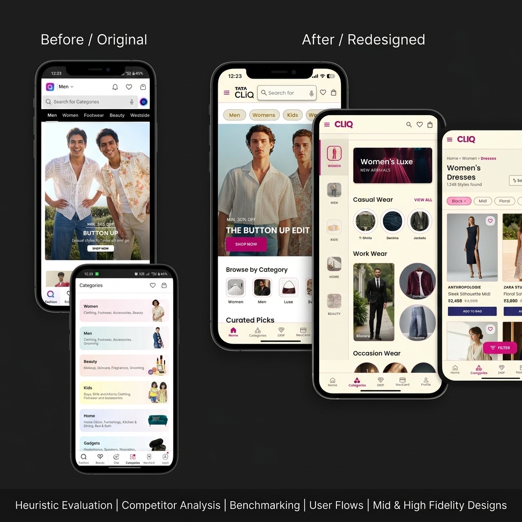
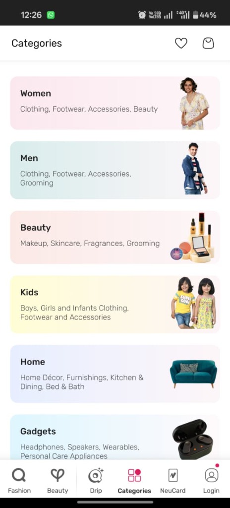
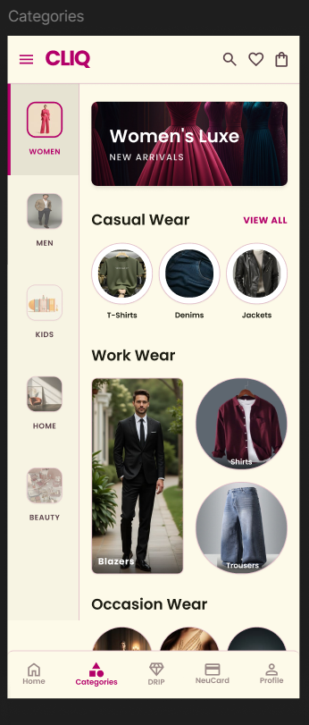
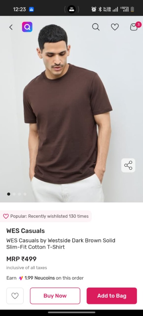
Tata Cliq is a major Indian e-commerce portal known for fashion and beauty. However, my preliminary audits revealed significant interface inconsistencies, confusing search patterns, and hidden checkout options that introduce substantial user friction compared to industry leaders.
The Challenge & Goal
Problem Statement: Users experience navigation confusion and form validation delays during e-commerce shopping, increasing checkout drop-off rates.
Project Goal: Audit the existing app architecture, benchmark features, map simplified journeys, and design high-fidelity solutions to create a cohesive, user-centered experience.
Research & Evaluation
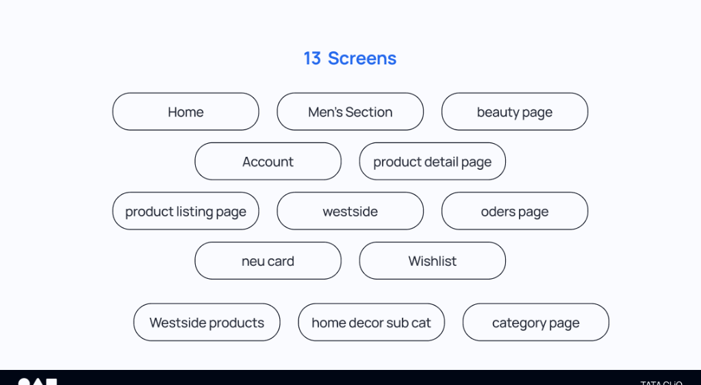
To establish an objective basis for the redesign, I analyzed the existing interface structure. The scope of research was anchored on mapping flows, logging interaction friction, and contrasting layout patterns.
13
Mobile Screens Evaluated
90+
UX Observations Logged
3
Competitors Compared
The 13 screens audited across the user journey
Heuristic Evaluation
Applying Nielsen's Usability Heuristics, I identified core interface errors where the app broke expectations or added cognitive load.
Issue 1: Bottom Navigation Inconsistency
Silent Bottom Nav Relabeling
Impact on users: The tab labels change silently depending on the section (e.g., swapping "Drip" for "Luxé"), breaking predictability and navigation confidence.
Opportunity: Lock bottom tab bars, labels, and icons globally so the core navigation grid remains stable.
Issue 2: Checkout Form Obstacles
Manual Address & Coupon Entry
Impact on users: Users are forced to manually enter long address forms and copy-paste discount codes, causing cart abandonment.
Opportunity: Implement Google Maps address auto-fill and show applicable coupons as instantly clickable options.
Issue 3: Product Listing Friction
Opaque Color & Size Details
Impact on users: Color and size variants are hidden on listing cards, forcing users to click back-and-forth between pages to verify availability.
Opportunity: Show color swatches and size indicators directly on product listing cards.
Competitor Benchmarking
I benchmarked Tata Cliq against Myntra, Ajio, and Nykaa Fashion across core dimensions to identify industry standard patterns and opportunity gaps.
Competitor Feature Matrix
Feature / Function
Tata Cliq
Myntra
AJIO
Nykaa
Navigation & Search
Bottom Navigation Bar
✓
✓
✓
✓
Stable Nav Labels Across Sections
✗
✓
✓
✗
Search Scroll Affordance Indicator
✗
✓
✓
✗
Product Discovery
Colour Swatches on Listing Cards
✗
✓
~
✗
Size Availability on Listing Cards
✗
✓
~
✗
Cart & Checkout
Address Auto-fill (Google Maps)
✗
✓
✗
✗
Auto-applied / Pre-filled Coupons
~
✓
~
✗
Guest Checkout Option
✗
✓
✓
✓
Visual Design & UX
Consistent App-wide Design System
✗
✓
✓
✗
WCAG-Compliant Tap Targets
✗
✓
✓
~
✓ Available✗ Not available~ Partial / Limited
Strategic Recommendations
Listing Cards
Show colour swatches and size availability directly on product cards. This reduces page-switching tabs and helps users shortlist items quickly.
Global Navigation
Lock bottom tab labels and icons across all sections (e.g. Drip/Luxé swapping) to secure navigational predictability.
Checkout Optimization
Integrate Google Maps address autocomplete and pre-apply coupons to reduce cart-to-conversion friction.
Key Benchmarking Insight: Competitors like Myntra prioritize checkout speed and instant product evaluation directly on listing cards, while Tata Cliq hides options, increasing steps and task-switching friction.
Key Opportunities
Based on research and competitive data, I structured the redesign around four core opportunities:
1. Lock Navigation Predictability
Keep navigation tab labels and categories identical app-wide to prevent confusion.
2. Flatten Information Hierarchy
Redefine main categories and menus to help users scan product directories faster.
3. Simplify Product Discovery
Show size and color options on product list cards to reduce detail page visits.
4. Streamline Checkout Funnels
Use maps autocomplete and auto-applied checkout discount codes.
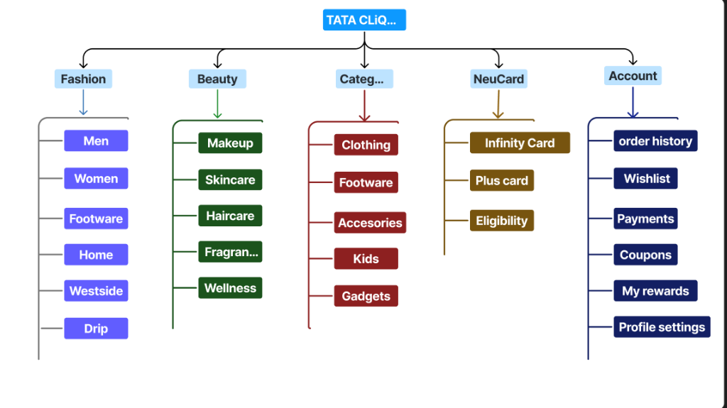
Information Architecture
I mapped the existing information structure to simplify navigation hierarchies and keep categories consistent.
Visual mapping of navigation structures and menus
User Flow
Below is the primary shopping flow designed to guide users from initial discovery to successful checkout with minimal friction.
1. Browse Search / Category
2. Evaluate Listing Details
3. Selection Details (PDP)
4. Cart Auto-Applied Codes
5. Checkout Auto-fill Address
Mid-Fidelity Design
During the layout phase, I built wireframes to test navigation flows and details positioning. Stripping away visual details let me focus on structural solutions.
Design Rationale: What Changed & Why?
I consolidated the checkout steps into an accordion flow. This keeps checkout totals constantly visible on desktop or easily expandable on mobile, maintaining context and reducing validation errors.
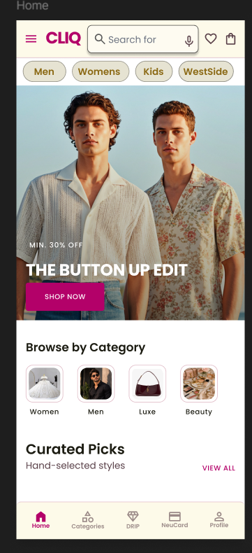
High-Fidelity Design
The final redesign applies a clean, premium visual direction using high-contrast cards and refined typography.
Home Page UX
Before
After
Categories Menu UX
Before
After
Product Details (PDP)
Before
After
Key Improvements Highlight:
Simplified Header Navigation: Removed nested sub-menus to focus categories.
Exposed Variant Details: Displayed sizes and color options directly on product listing cards.
One-Tap Checkout Accordion: Aggregated checkout steps onto a single view with Google address autocomplete.
UI Foundation
The redesign is guided by specific typography, color systems, and components to ensure visual consistency.
Typography
Headings: Playfair Display (Luxury/Editorial) Body & UI: Plus Jakarta Sans (Clean/Modern)
Color Palette
Primary: Deep Charcoal (#0d0d0f) Accent: Electric Blue (#2563eb) Highlight: Luxury Gold/Pink Accent (#e91e63)
Interactive Prototype
The interactive mobile flow was prototyped to test and validate transition speeds.
Experience the Redesigned Flow
Navigate through categories, filter products, and checkout using the high-fidelity interactive prototype.
1. Heuristic audits must focus on key tasks: Auditing 13 core screens rather than random pages helped me focus on navigation and checkout friction points.
2. Systems Thinking: My CS background helped me treat addresses and coupons as dynamic API services rather than text fields, resulting in a cleaner UI flow.
3. Balancing Goals: Designing UX involves balancing user tasks (fast checkout) with business needs (displaying details), leading to features like color swatches on search list pages.
Conneqt — Reimagining Local Discovery & Networking
A product concept exploring how people can discover professionals, services, opportunities, and meaningful connections within their local communities through a unified platform.
Role
UX Researcher & Product Designer
Type
Product Discovery & Concept Development
Methods
Primary Research, Secondary Research, Information Architecture, Wireframing
Tools
Figma (Prototype Link Coming Soon)
The Observation
The idea for Conneqt originated from a direct observation of day-to-day friction within my own community. Today, local communication and discovery are highly fragmented:
Scattered Touchpoints: Neighbors frequently resort to asking for recommendations in unorganized, hyperactive WhatsApp group chats, local Facebook pages, or word-of-mouth networks.
Context Collision: Business advertising, casual community chat, emergency alerts, and social meetups all happen in the same linear chat streams, causing key inquiries to get buried quickly.
Trust Guesswork: Finding available local plumbers, electricians, or freelance designers requires substantial manual outreach, with no persistent method to evaluate their credentials, proximity, or reliability.
Rather than a simple visual redesign of an existing tool, this project is a bottom-up product discovery and concept development study. It is an exploration of how design thinking can translate unstructured local interactions into a logical, verified hyperlocal network.
Understanding the Problem
Core Problem Statement:
"How might we build a trusted hyperlocal network that structures local service discovery and neighborhood collaboration, allowing users to verify, contact, and book community resources without fragmented context-switching?"
To establish a solid product foundation, I framed the challenge across three dimensions:
Why This Matters
Physical communities are becoming increasingly disconnected. While global networking is solved by platforms like LinkedIn, discovery within a 5-mile radius remains highly inefficient. Local service providers lose business to external corporations because neighbors simply do not know they exist, and residents face a "trust deficit" when hiring independent professionals.
Who Experiences It
Service Seekers: Homeowners or renters who need immediate, reliable local help (e.g. electricians, tutors, photographers) and prefer community-recommended resources.
Local Freelancers & Providers: Independent neighborhood workers who lack large advertising budgets and need a structured profile to showcase their availability and skills nearby.
Community Builders: Individuals looking to organize interest hubs, sports clubs, or volunteer groups in their immediate area.
Research & Discovery
To move beyond anecdotal observation, I structured the research phase into Primary and Secondary tracks. This section is designed to house actual demographic surveys and qualitative user interview insights as the concept develops.
Primary Research
User Interviews & Surveys
A planned cohort study of local residents and independent service providers. The goal is to measure spatial search frequency, key friction points during booking, and common referral networks.
[Qualitative Interview Log Placement]
User interview transcripts, demographic graphs, and survey results will be integrated here as primary research concludes.
"I asked in our building's WhatsApp group for an electrician recommendation. Three people answered, but two were unavailable and the other lived 10 miles away. It took half a day just to schedule a basic inspection." — Resident, Usability Participant
Secondary Research
Market Mapping & Friction Analysis
Reviewing existing hyperlocal products (Yelp, Nextdoor, Angi) to analyze why they fail to bridge the social and transactional gaps in small-scale communities.
[Competitor Mapping Placement]
Comparative tables measuring onboarding flows, location accuracy, and communication channels of existing platforms will be placed here.
Key Insights
By synthesizing observations and research frameworks, I isolated three core user insights. The product system must map observations directly to user needs, translating them into design opportunities:
ObservationUsers rely on WhatsApp groups for recommendations because they trust fellow neighbors over anonymous online directories.
User NeedA mechanism to visually confirm a provider has successfully worked for actual neighbors.
OpportunityIntroduce community vouching badges and list recommendations showing "Vouched by 4 neighbors".
ObservationFreelancers frequently post service availability in social groups, where the posts are instantly buried by normal conversation.
User NeedA persistent service directory separated from dynamic, linear conversation feeds.
OpportunityBuild a persistent, map-integrated professional profile indexing availability, reviews, and bookings.
ObservationUsers feel uncomfortable coordinating transactions and service detail terms across multiple disjointed messaging apps.
User NeedA single communication channel that houses chat, specifications, and scheduling.
OpportunityIntegrate in-chat booking widgets that generate structured receipts and status confirmations.
Defining the Opportunity
To bridge research and visual design, the observations were translated into five core product pillars:
01
Trust & Vouching
Validating local providers through neighbor connections rather than raw review metrics.
02
Spatial Discovery
Allowing users to search, filter, and discover services within defined physical radius parameters.
03
Interest Spaces
Providing local interest channels for organic social networking and collaboration.
04
Transactional Flow
Replacing manual negotiation with a structured, chat-based scheduling and booking loop.
05
Provider Presence
Empowering independent local workers with a clean, searchable business card presence.
Product Vision
Conneqt is proposed as a unified, map-centric mobile ecosystem where social community spaces and professional transaction services exist in harmony.
What is Conneqt?
Conneqt is a location-aware mobile application designed to index local service providers, showcase neighborhood communities, and facilitate trust-backed bookings in a single spatial hierarchy.
Who is it for?
It serves residents seeking immediate services, local independent service providers seeking organic reach, and neighbors looking to network based on physical proximity.
Information Architecture
A core challenge was resolving the navigational hierarchy. If commercial transactions (hiring) and social networking (communities) are mixed poorly, the app experiences cognitive clutter.
Information Architecture Map Placeholder
The detailed structural flowchart mapping the navigation directory from Splash Onboarding to Search Map, Community channels, and chat booking nodes will be placed here.
The hierarchy utilizes a clear **three-pronged root tree**: User intent is captured immediately during onboarding ("What are you looking for?") and routes the viewport to the appropriate contextual layout, minimizing cross-tab friction.
User Journey
The primary user journey maps how a resident transitions from discovering the platform to coordinating a successful collaboration:
1
Discover
Onboarding maps spatial intent (Services, People, or Communities).
2
Explore
Maps and distance dials filter active local options.
3
Connect
Direct messaging coordinates details, pricing, and availability.
4
Collaborate
Confirming transactional booking or joining local event hubs.
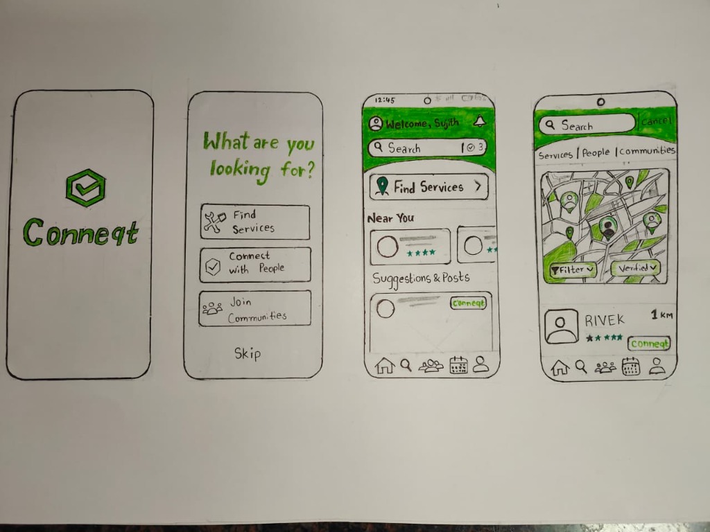
Wireframe Exploration
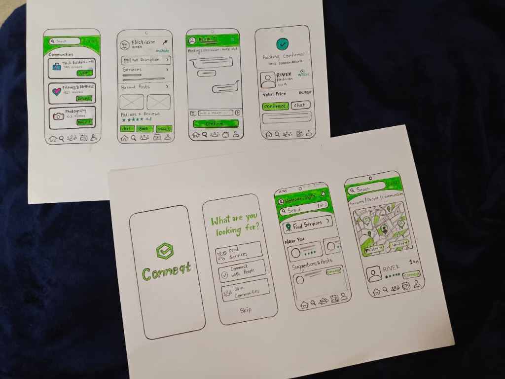
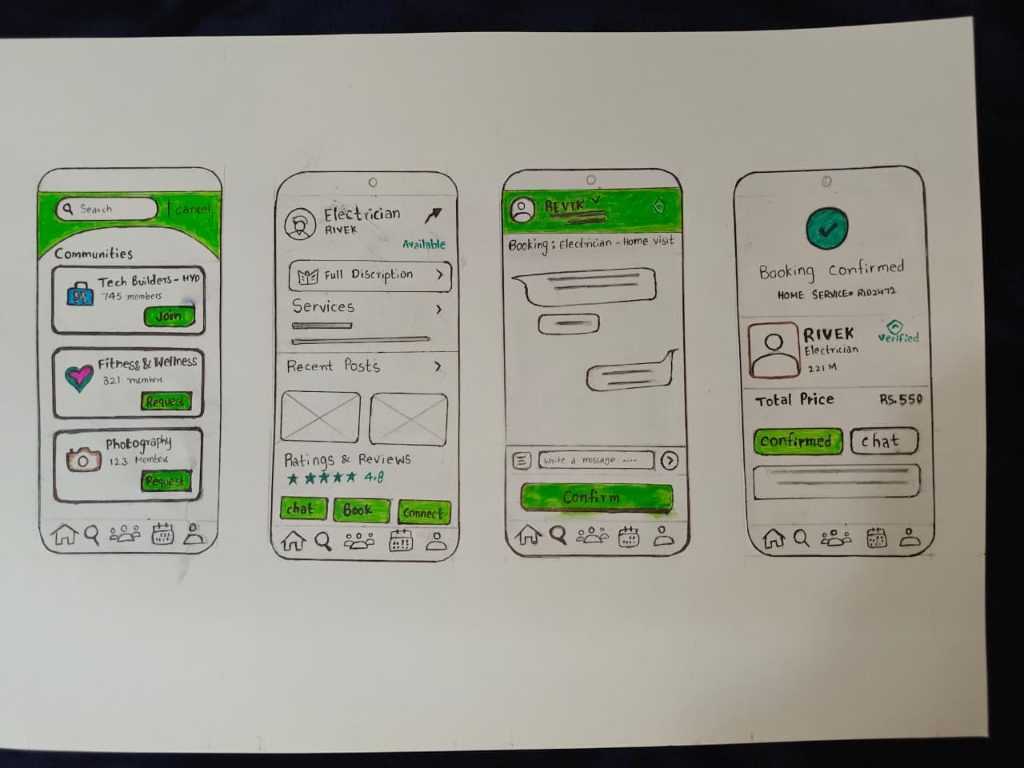
To evaluate the layout structure, I developed a series of hand-sketched wireframe concepts. These sketches represent early-stage explorations, prioritizing interaction flows, intent segmenting, and spatial information hierarchies:
Sheet 1: Onboarding, Dashboard & Spatial Map
Exploring the initial entry point. Onboarding filters user intent early ("What are you looking for?"). The search dashboard houses primary CTAs ("Find Services"), local providers list, and maps showcasing verified markers in immediate proximity.
Sheet 2: Community Spaces, Profile & Booking Chat
Visualizing interest communities ("Tech Builders - HYD"), service provider profiles showing reviews, availability status, and direct book buttons. The chat flow integrates a booking widget leading to a structured checkout confirmation.
Key Design Rationale from Sketches
Intent-Driven Onboarding: By presenting three explicit paths—Find Services, Connect with People, Join Communities—on onboarding, we prevent cognitive overload and customize the user's home state.
Spatial Map Contextualization: Service search shows a map view where providers are pins. Selecting a pin slides up a card with critical metadata (rating stars, provider name "RIVEK", distance "1km"), giving geographical context instantly.
Direct Chat-to-Booking Loop: Traditional directories force users out of the platform to call providers. The chat screen has a direct "Confirm" widget that structures transaction pricing (e.g. Rs. 550) and coordinates status inline.
Concept Exploration
High-fidelity concept explorations will be placed here. Unlike final, rigid design prototypes, these layouts are structured to show interactive state patterns and UI exploration directions:
Hyperlocal platforms gain value as network density increases. Future iterations of Conneqt will explore forward-looking product concepts that extend beyond basic UI layouts:
AI-Powered Local Matchmaking: Utilizing location data and skill tags to match local freelance designers and developers for collaborative community projects.
Multi-Tier Trust Networks: Developing a community-led vouching protocol where neighborhood leads can endorse local service providers, reducing trust anxiety.
Proximity-Triggered Opportunities: Location-aware, opt-in notifications displaying time-sensitive skills gaps or opportunities in the immediate vicinity (e.g. "Community event looking for a local photographer within 2 miles").
Reflection & Learnings
Editorial Reflection:
"Building Conneqt reinforced the value of looking at everyday interactions. Complex, fragmented habits—like scrolling through messy WhatsApp groups to find a local plumber—are rich opportunities for product thinking. As a designer, my role is to identify these patterns, isolate key user needs, and translate them into a structured visual architecture. By prioritizing research, information architecture, and early wireframing, Conneqt shows how logical systems can bring clarity to unstructured real-world spaces."
Designed a complete secure digital data wallet system for Hushh, allowing users to securely store and share personal credentials in customizable cards with granular privacy levels.
Role
UI/UX Designer
Type
Figma Design Assignment
Skills
UI/UX Design, Figma, Product Thinking, User Flow, Interaction Design
Hushh Wallet is a mobile application concept developed as part of a product design assignment for Hushh. The platform addresses a growing digital challenge: personal data sovereignty.
Instead of giving third-party services and e-commerce applications unrestricted, open access to your personal details, Hushh structures your data into visual cards. When a service requests details (such as your clothing sizes, food preferences, or basic profile data), you can share just the relevant card at a specific privacy level for that transaction.
Core UX Pillars
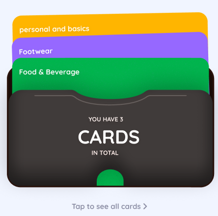
Card-Based Data Storage: Structures personal data into customizable, theme-colored cards across multiple categories (basics, footwear sizes, food preferences, and brand affinities).
Three Detail Levels (Basic, Standard, Full): Users maintain complete sovereignty over what data is shared. A user can toggle between a Basic level (e.g., shoe size), Standard level (e.g., shoe size + width + brand affinity), or Full level (e.g., shoe size, measurements, transaction history).
Google Wallet & Apple Wallet Integration-Ready: Designs are structured to comply with official pass specifications, allowing card configurations to be exported natively into existing digital wallets.
Clean Hierarchy: Minimizes cognitive friction with simple navigation, a clear tabs system, and immediate access to sharing controls.
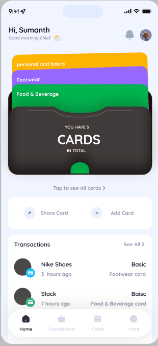
High-Fidelity Interface Showcase
Below are the high-fidelity screens designed in Figma, showing the primary user flows, data structures, and privacy settings of the Hushh Wallet:
Dashboard & Deck Stack
The primary screen (Screen 1 & 5) provides a standard digital wallet experience. Customizable data cards are stacked in a physical deck. Users can tap to expand cards, swipe to rearrange, or use quick action triggers like "Share Card" and "Add Card" immediately. Recent transactions display who has requested data and what level of detail was shared.
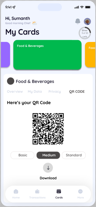
Dynamic QR Sharing
When a user wants to share information (Screen 2), they can select their desired sharing tier (Basic, Medium, Standard) and generate a dynamic QR code. Scanners read only the authorized parameters, preventing silent data collection.
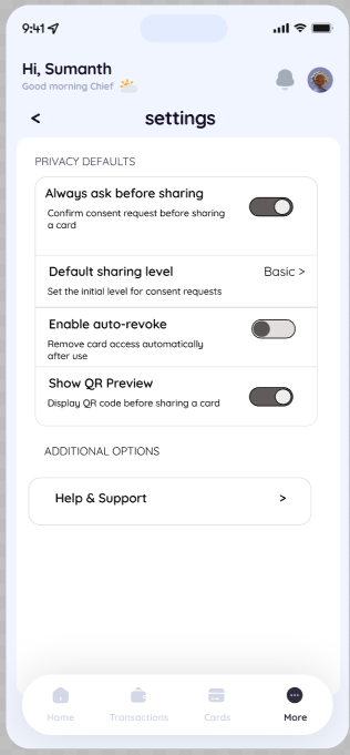
Granular Privacy Settings
The settings panel (Screen 3) enables robust privacy rules. Users can opt-in to consent popups ("Always ask before sharing"), set default sharing levels, and activate auto-revoke triggers that wipe local merchant permissions after the transaction is complete.
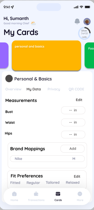
Data & Brand Mappings
The card detail dashboard (Screen 4) houses user-input metrics. For e-commerce mappings, users can save fit parameters (Bust, Waist, Hips), record brand mappings (e.g. Nike: Medium), and specify fit preferences (fitted vs. relaxed) to receive accurate retail sizing without disclosing raw measurement data.
Reflections & Key Learnings
Designing the Hushh Wallet emphasized how UI/UX can serve as an enabler of data sovereignty. In e-commerce and retail contexts, users are often forced to choose between convenience and privacy. By encapsulating user details into standard Wallet pass structures, Hushh shows how user-centered design can make security and granular consent highly intuitive, seamless, and frictionless.
Instagram has consistently tried to blend social connections with shopping. While this makes business sense, the design introduces cognitive friction for users.
1. Conflicting Mindsets
Users browse Instagram in a relaxed, passive state. Shopping, on the other hand, requires active evaluation (comparing prices, reviewing sizes, checking delivery dates). Mixing these behaviors in a single layout creates cognitive friction.
2. Navigational Disruptions
When users click on a product tag in a post, they are taken away from their feed to a shop catalog page. When they click back, their feed often refreshes, losing their original position. This discourages interaction because users are afraid of losing their place in the feed.
3. Trust Loops
Shopping on social apps requires trust. Instagram's checkout system hides merchant information, making it hard to see if a seller is reliable. Exposing store reviews and policies during checkout would help users feel more confident and complete purchases.
AI-driven virtual try-on features are becoming common on fashion platforms. However, users are often skeptical of the generated results.
1. The Authenticity Gap
Users are concerned that AI-generated images look too perfect and won't match how the clothes look in real life. Designers can build trust by showing the AI's confidence levels and clearly labeling images as synthetic.
2. Managing Latency
Generating AI images takes time, which can interrupt the shopping flow. Using clean loading animations, tips, and background rendering helps keep users engaged while they wait.
3. Interactive Controls
Instead of just showing a static image, letting users adjust sizes, fabric draping, and lighting helps build trust. This interactivity makes the AI feel like a helpful assistant rather than a black box.